Empowering Policyholders with Greater Control in the Billing Center
The Goal: Enable Policy Self-servicing
Based on user research, I identified several high-priority self-service features requested by policyholders. Here are a few product improvements gathered from research: COI generator, update payment method, and policy endorsement. Considering both user needs and available engineering resources, we (PM and myself) prioritized launching the self-service payment feature first.
Role: Lead Designer • UX/UI
Cross-functional partners: PM, Engineering (Backend + Frontend)
Tools: Figma
User goals: Enhance self-service (premium payment & update payment method), empower the end-user with more confidence and trust
Business goals: Reduce late or failed payments, prevent policy lapse/less user friction, improve cash flow reliability, user retention
Duration: 2-3 months
Project status: Live
Policyholders needed more control and oversight into their policies
THE PROBLEM
Where do you start when users need more features to feel they’re in control of managing their account? Through user interviews and surveys, I compiled a list that identified key pain points for the users.
After collaborating with Product and ENG, I prioritized the list to determine what could be the quickest build for immediate value. The focus was to ship iteratively to release high-impact UX improvements early and often based on user feedback and measurable business outcomes.
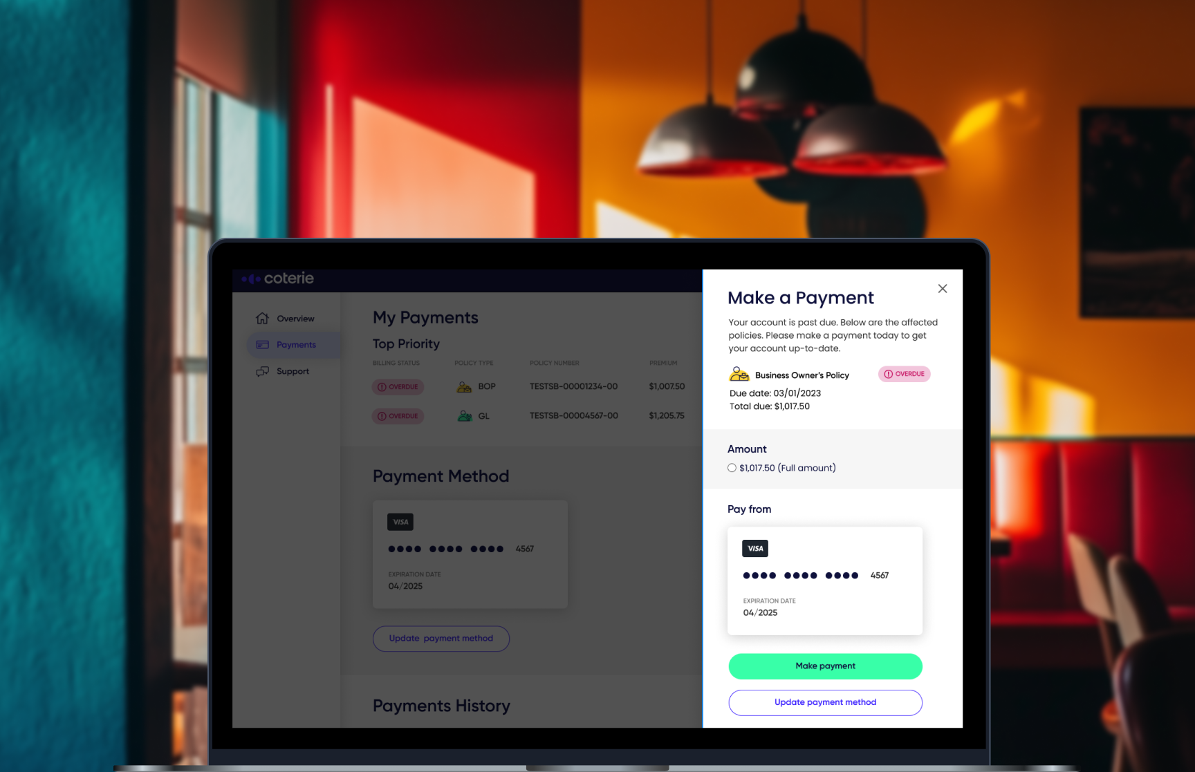
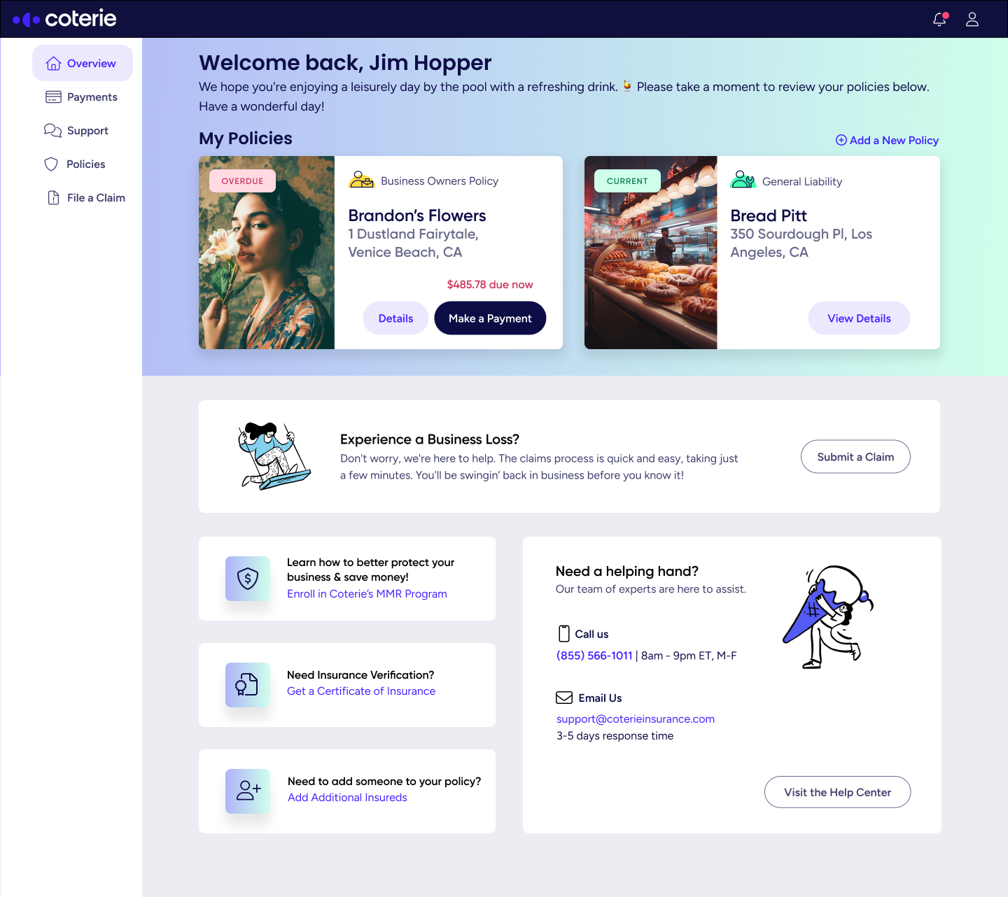
THE SOLUTION: PAYMENT DRAWER
A faster, more intuitive, and trustworthy experience.
The payment drawer was designed for a seamless experience for policyholders to pay premiums and update credit card information without leaving the dashboard. By reducing navigation, simplifying the steps, and providing immediate feedback, the drawer decreased friction, increased confidence in payment success, and allowed users to self-serve critical billing tasks.
Delivering incremental features delivers immediate value that compounds over time as additional enhancements are released.
Payment drawer protoype recording
AFTER-LAUNCH: METRICS
Boosted self-service billing completion from 42% to 68%
Direct impact: more user autonomy and a reduction in customer service support.
Lowered billing-related tickets from 320 to approx. 230 per month
Direct impact: Lowered billing-related tickets at around 90 less per month!
PLANNING AHEAD: FUTURE STATE OF THE BILLING CENTER & DASHBOARD
Designing in parallel with Engineering
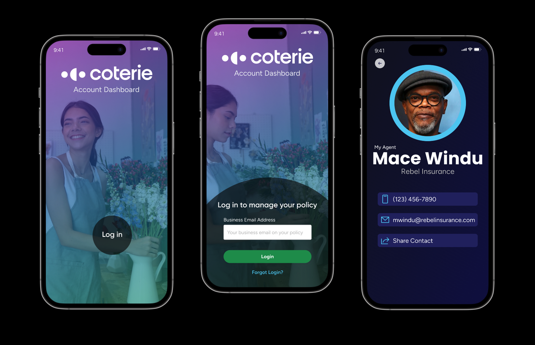
In the spirit of collaborative, agile design, I needed to continue iterating on the product by further researching and identifying user pain points and business opportunities. Below are some design explorations of the policyholder billing center for mobile.
Mobile policyholder dashboard experience prototype video capture
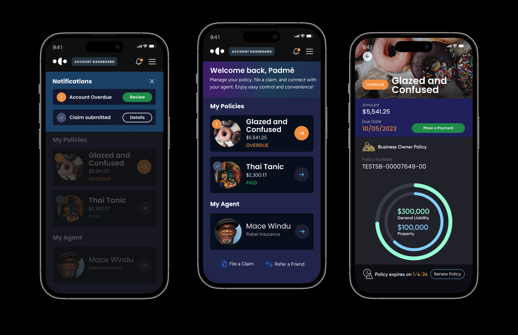
In the spirit of collaborative, agile design, I needed to continue iterating on the product by further researching and identifying user pain points and business opportunities. Below are some design explorations of the policyholder billing center.
Mobile policyholder dashboard experience stills
Below are some design explorations of the policyholder billing center.
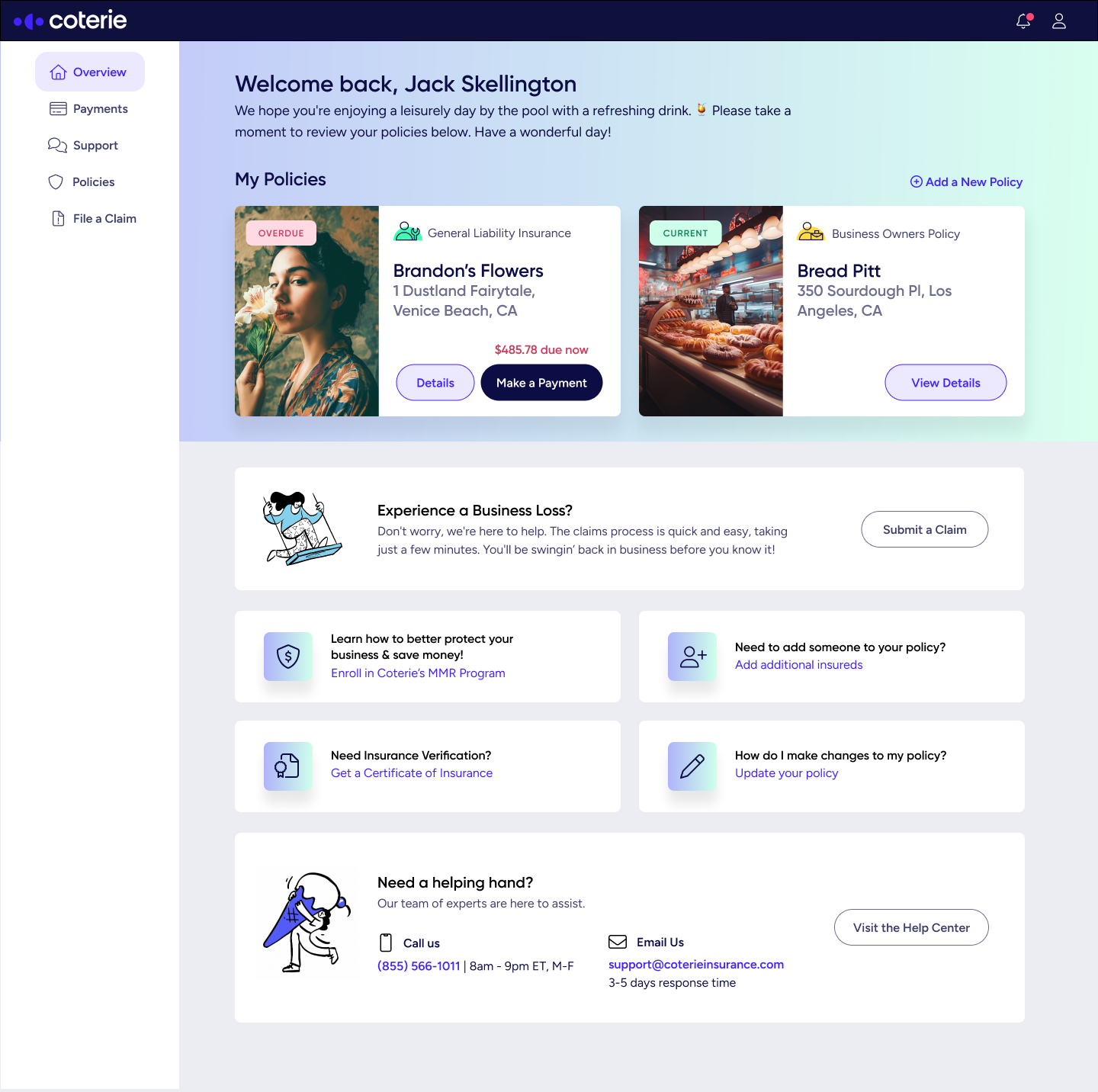
Policyholder dashboard homepage concept
In this design concept, I’ve elevated the overall design aesthetic and improved usability by surfacing actionable items that policyholders requested to be at their fingertips. The design aligns with our current styleguide but I added some illustrative icons (Compliments of Blush Design).
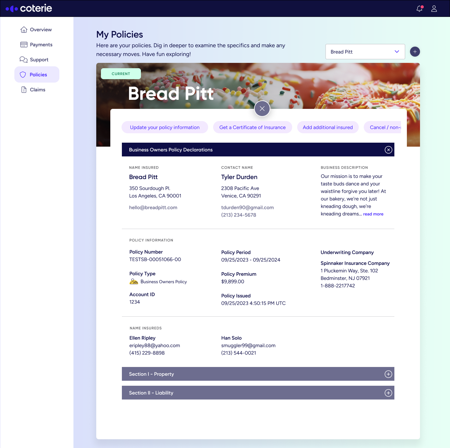
Policy endorsements
To reduce frustration around navigating complex, jargon-heavy policies, especially when managing endorsements, I redesigned the policy management experience to be clearer and easier to use. I introduced a more visual and scannable interface that helps users quickly find specific endorsements, understand how their coverage has changed, and take action in just a few clicks.
Video showing how a policyholder can click into their policy to view endorsements.
Agent Dashboard Explortions
In the spirit of collaborative, agile design, I needed to continue iterating on the product by further researching and identifying user pain points and business opportunities. Below are some design explorations of the agent dashboard.
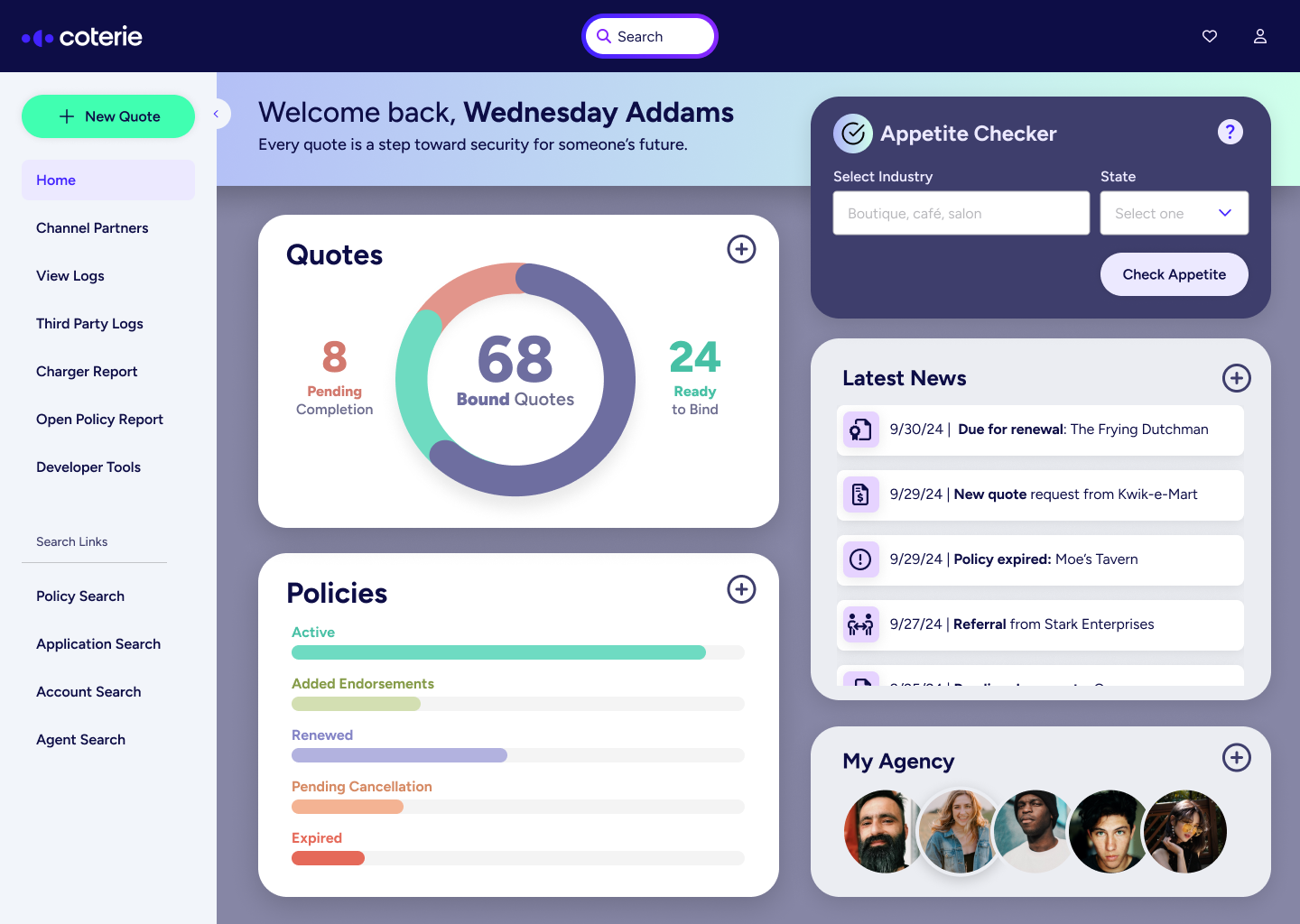
Agent dashboard design concept in action